-
Type:
Task
-
Resolution: Won't Fix
-
Priority:
Critical - P2
-
None
-
Affects Version/s: None
-
Component/s: Education
-
None
-
None
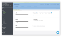
For educational and presentation purposes, Compass is using too much pixel real estate on the top menu where the information of the namespace and collection statistics.
This happens because when we record, we use a smaller screen to adjust to an optimal video size (1280*720 px) for internet videos.
We can zoom in, and benefit from chromes/browser font size enlargement, however that just makes everything on that view port to be larger, which makes the problem worst.
The suggested fix would be to allow collapsing collection-view div header first 2 rows or to allow the detach of the schema-container
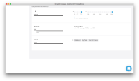
I've attached a screenshot of the problematic divs.
cc/ shannon.bradshaw

