-
Type:
Story
-
Resolution: Duplicate
-
Priority:
Major - P3
-
Affects Version/s: None
-
Component/s: None
-
None
-
Not Needed
User story
As a Compass user
I want to see visible, friendly, helpful and designed error messages
So that I understand if Compass is broken or if instead there is actually something wrong with my connection/cluster/permissions.
Acceptance criteria
- When an error happens, it should always be visible to the user
- When I see an error, I want a user friendly explanation of what went wrong
- When I see an error, I want the necessary information to fix it or work around it
- When an error happens, I don’t want Compass to look broken
- There are very good reasons for some errors to happen (e.g. permissions problems for the current user). The errors we currently display make me think Compass was not expecting the error and therefore broke. We can probably make it look less broken if error messages are a bit more designed and communicate the problem with some copy we write instead of exposing the error from the driver.
Notes
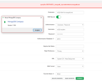
- Attached are some example of errors messages we currently have in Compass
- is related to
-
COMPASS-2877 Make connection error messaging more helpful
-
- Closed
-
